iTunes 11, whose delayed release fueled much speculation about last-minute changes following an internal reorganization at Apple, sports the most radical alterations to the program’s interface since its inception. Previous upgrades to iTunes were incremental, adding features and tweaking the interface, but iTunes 11 puts a whole new face on the software. In addition, iTunes 11 seems to be designed more for playing music than for organizing it—a slightly anachronistic approach, given the prevalence of portable devices.
The most obvious change is the reintroduction of color to the program. In my review "First look: iTunes 10," written in September 2010, I lamented the absence of color, saying, “iTunes 10 has a somewhat Soviet utilitarian look which, to my eyes, makes it less interesting to work with.” Well, color is back, both in the sidebar and in the Library pop-up menu at the top left of the iTunes window. In addition, when you display playlists, their text will be larger and bolder, and the background of the Playlists column will be lighter, providing much better contrast. The program also uses a Helvetica font with reduced spacing between letters, enabling iTunes to display longer texts in short spaces (such as in the Playlists column).
Viewing your music
The new options to view music by Genres or by Artists display sidebars showing icons for genres or for artists, with icons from your album art. (Videos, Books, and other types of content offer similar options.) You can sort items in these views as you like: Press Command-J to display a tiny View Options window, where you can sort by Title, Artist, Year, or Rating, for example, when in Genres view.
Apple removed some views from iTunes, but it increased the number of view options. In each view mode—Songs, Albums, Artists, or Genres—you have sort options, but if you click Playlists, and then select a playlist, the View button near the top right of the iTunes window gives you even more options. Although I regret the loss of Album List view, I’m quite happy with some of the new options.
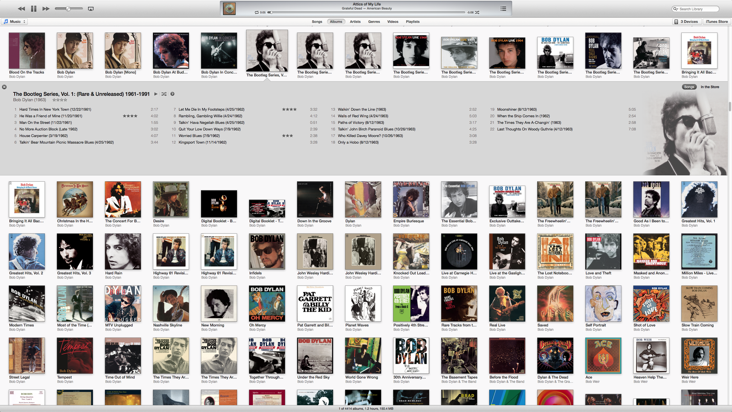
In Albums view—the new default view—everything is an album; that is, whether the actual content is a single song, a few songs from an album, or an entire album, a single graphic represents it. The only way to determine how many tracks are collected there is to click the graphic. This design choice is surprising, as younger music fans tend to focus on individual songs rather than on albums.
When you're in Albums view, you can click a graphic to see what’s behind it. The expanded view shows the tracks in several columns (if there are enough tracks), with the album artwork to the right. The background and text take on colors from the album art. (To turn off the expanded view’s colors and album art display in the General preferences, uncheck Use custom colors for open albums, movies, etc.)
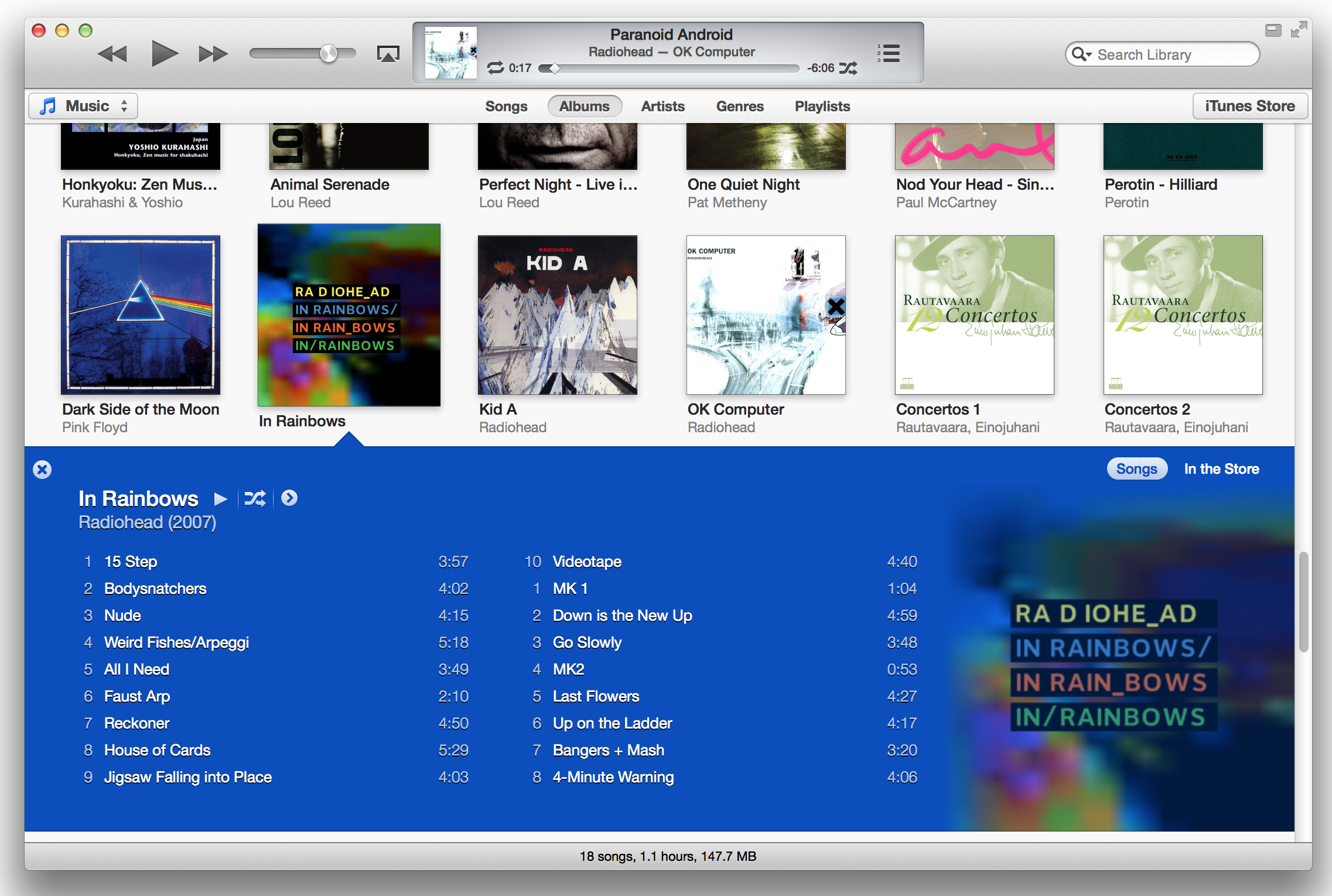
The limited information shown in Albums view can make it harder to choose what you want to play. Imagine that you have an album containing several songs you like, but you can’t remember which ones. If you haven’t rated them, there’s no way to identify your favorites. In previous versions of iTunes, you could see information such as play counts and last-played dates, but in iTunes 11 you can't. So if you don’t remember the song you liked so much on a particular Radiohead album, say, you won’t be able to find it quickly. You can get the information in Songs view, but that view is sterile and uninviting, with no album art and no clear separation between albums.
Also in Albums view, iTunes groups compilation albums at the bottom of the list. This leads to two problems. First, nothing tells you that the compilations are compilations; as there are no letters to give you milestones in the album list—such as A, B, or C, for artists’ names—you don’t known where the compilations section starts (and it’s hard to tell where a particular artist is at a glance). Second, the artist listed below the title of a compilation is the artist of the first track of the album; identifying the performer as “Various Artists” would have been more helpful.
You can’t change the size of the icons in Albums view, most likely because of the new track display in the expanded view. The fixed icon size limits the way you view your content, and the very wide display of tracks is neither very practical nor economical, at least on a large display. On my 27-inch Cinema Display, 15 albums string across the screen in Albums view, and as many as four columns for track names in expanded view, which looks odd to me; when I make the window smaller, as on a laptop, the two or three columns that display are much more readable. Another drawback: The small icons truncate titles that are longer than about 20 characters.
Other elements of iTunes 11 suggest that it was designed for small displays. If you don’t show the sidebar, the buttons for accessing different features are very far apart. On the left, a pop-up menu lets you choose which library to view. But to access your devices—iPhones, iPods, and iPads—or to go to the iTunes Store, you have to move your mouse all the way to the other side of the screen. Clicking the button to activate the Mini Player involves the same long-distance mouse travel, though there’s a keyboard shortcut for that: Command-Option-3.
By default, the entire iTunes window displays your content in what was previously called Grid View. The sidebar is hidden, though you can display it by pressing Command-Option-S or by choosing View > Show Sidebar. List View, which you can access it by clicking List in the header bar, is still available for content other than Music; but Cover Flow and Album List views are gone. In the Music library, this is called Songs view.
Classical music fans are out of luck with iTunes 11. The only way to view your music by Composer is to use the hard-to-navigate Songs view. Neither the Artists nor the Genres view provides a Composers column; and the Column Browser, which could simplify matters, is available only in Songs view.
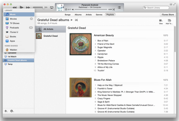
Playlists
You can view playlists in a new way. Click Playlists in the header (the sidebar must be hidden for this option to be available), and you'll see a sidebar that displays only playlists. A pop-up menu above the list offers access to your different libraries—Music, Movies, TV Shows, and so on. Another pop-up menu, this one at the right side of the iTunes window, provides access to your iOS devices.
With the new Playlists view also comes a new way of creating playlists. Click the Add To button at the right of the iTunes window to show a two- or three-pane display. On the left are Songs or Albums in a single pane, or Artists and Genres with a list to the left and content in the middle. Your playlist is on the right; you can drag items to it, and click Done when you’ve finished.

Curiously, if you have the sidebar displayed, you don’t see the Add To button when you click a playlist, and you have to manually drag items to the playlist. This surprising situation is one of the many inconsistencies in iTunes 11, where controls appear and disappear according to what you are viewing and how.
All of these view options are essentially the same for other types of content. I’ve focused on music here, but movies, TV shows, books, and so on, inherit the same
No comments:
Post a Comment